
Don’t Give AI Ideas
“Don’t give AI ideas” is starting to sound less like a joke when we see agents accessing unexpected…
Search

“Don’t give AI ideas” is starting to sound less like a joke when we see agents accessing unexpected…

For years, much of interaction design has started from a fairly simple premise: the user decides…
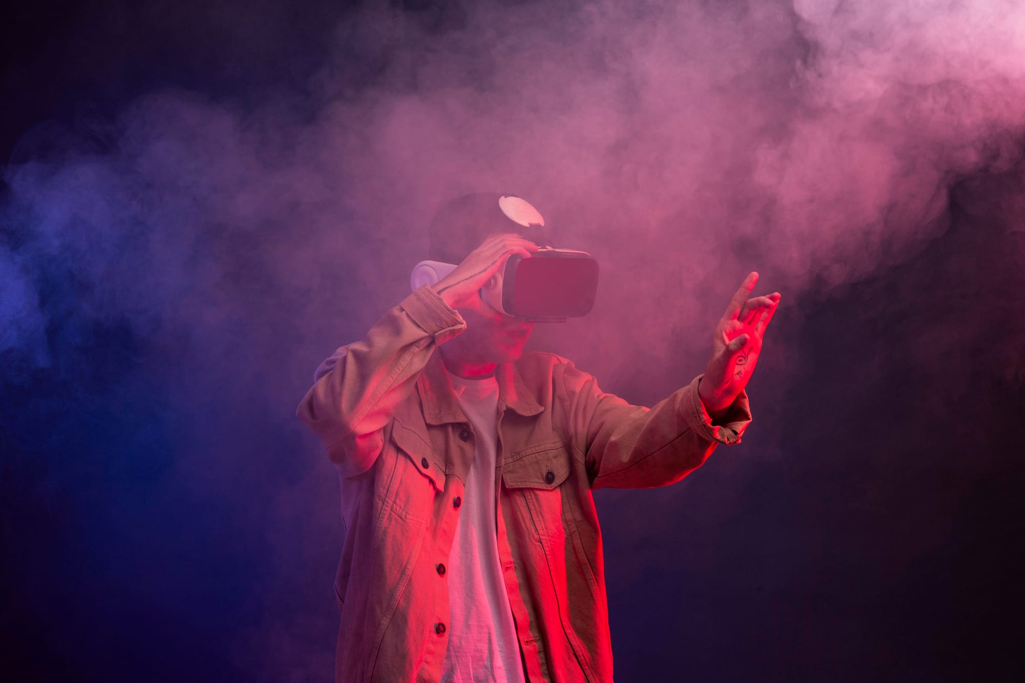
How do we design useful experiences for smart glasses and everyday augmented reality? The question may seem technical, but it is, in fact, deeply human. It is not simply about adapting an interface to a new device, or moving buttons, menus or notifications onto a pair of glasses. It is about understanding what happens when digital information is no longer confined to a screen and begins to coexist with a person’s body, surroundings and attention.
Until now, much of UX design has worked within a fairly recognisable framework: computer, mobile phone, tablet or smartwatch. Screen sizes changed, gestures changed and moments of use changed, but the experience still had a clear boundary. The user looked at a device, interacted with it and, to some extent, could decide when to enter and when to leave that experience.
With smart glasses and everyday augmented reality, that boundary becomes more blurred. The interface may appear while someone is walking down the street, looking at a product in a shop, following a route, talking to someone else, working with their hands occupied or trying to interpret something in front of them. The digital experience no longer competes only with other screens, but with the user’s immediate reality.
This change forces us to rethink an essential part of design. It is no longer enough to ask whether an interface is clear, attractive or efficient. We must also ask whether it deserves to appear at that moment, whether it provides genuine value, whether it respects the user’s attention and whether it intrudes on a situation that perhaps ought to remain free from digital layers.
That is why the challenge of XR is not to prove that it can be spectacular. That idea often takes us into the realm of hype: eye-catching demos, futuristic promises and experiences designed more to impress than to be used. The real challenge is to design experiences that are useful, discreet and respectful enough to fit into everyday life without turning every moment into an interface.
When the interface is no longer contained within a screen, design stops being merely a visual or functional matter. It also becomes a spatial, social and behavioural one. Designing for smart glasses does not simply mean bringing an app to a new platform; it means deciding when a digital experience should appear, when it should quietly accompany the user and when it should disappear entirely.
When we talk about XR, it is easy to imagine large immersive experiences: virtual worlds, 3D environments, complete simulations or interfaces that fill the entire field of view. But everyday augmented reality will probably not always play out in that space. In many cases, its value will lie in precisely the opposite: intervening little, appearing only when needed and demanding no more attention from the user than necessary.
On smart glasses, many interactions will not need to be spectacular. They may be as simple as a directional cue, a brief translation, a contextual alert, a visual confirmation, a discreet reminder or a reference that helps someone understand what is in front of them. Small layers of information that do not replace reality, but accompany it.
Therein lies one of the major changes for design. For years, many digital interfaces have competed to capture attention: more time spent using them, more interaction, more notifications, more stimuli. In everyday XR, this approach can quickly become a problem. When the interface is close to the eyes, the body and the immediate surroundings, capturing attention is not always a virtue. Sometimes, the best design will be the one that knows how to accompany without disturbing.
Apple, Google, Meta and Snap may be exploring different scenarios, from more immersive devices to lighter, more social glasses. But the underlying challenge is shared: integrating digital technology into real life without disrupting it. Useful XR will not be what turns every moment into a technological demonstration, but what knows how to appear judiciously, offer something specific and withdraw before becoming noise.
In everyday XR, attention becomes the most delicate resource. A notification on a mobile phone can be annoying, but it can also be ignored, postponed or tucked away in a pocket. A notification in front of your eyes carries a different weight: it enters the visual field directly, interrupts the immediate surroundings and can alter a conversation, a journey or a task requiring concentration.
That is why designing for smart glasses requires a far more restrained visual hierarchy. Not everything that can be shown should appear on the lens. And not everything that is useful in a mobile app makes sense when the user is walking, looking at another person or making a decision in real time.
Design must learn to prioritise better. The most important information is not always the most urgent, and the most urgent information does not always need to occupy the centre of vision. In this kind of experience, interaction patterns should favour discretion: show only what is needed, reduce exposure time and avoid turning every piece of information into an interruption.
Some principles can help us design these microinteractions better. Contextual priority makes it possible to decide what appears according to the place, the action or the level of attention available. Progressive information avoids showing everything at once and reveals details only if the user needs them. Silent modes reduce the interface’s presence in social or sensitive moments. Peripheral alerts can notify without obstructing vision. Minimal confirmations help validate actions without turning every step into a dialogue. And automatic disappearance prevents information from continuing to take up space once it is no longer useful.
In this context, a good interface is not one that is always present, but one that understands the fragility of human attention. Designing for XR means accepting that, many times, the best use of the screen is not to use it.
In XR, designing an interruption is not simply about deciding which message to show. The underlying question is far more demanding: do we have the right to show it now? When an interface lives close to the eyes and accompanies a user in motion, every appearance has a greater impact than it would on a conventional screen.
A digital layer can interrupt a conversation, distract during a journey, break concentration on a physical task or introduce unnecessary tension into a social moment. What would be just another notification on a mobile phone can feel like an intrusive presence on smart glasses.
That is why design must distinguish more carefully between types of information. There is urgent information, which justifies appearing immediately because it affects safety, time or a critical decision. There is useful information, which may help the user but does not necessarily need to interrupt them. There is information available on demand, which should appear only when the person asks for it. And there is information that should simply stay on the mobile phone.
This classification is not only functional; it is also ethical. A responsible XR experience should not measure its success by how often it manages to appear, but by its ability to reduce cognitive friction. Good design does not add layers by default. It assesses the context, respects the moment and understands that interruption always comes at a cost.
In everyday augmented reality, the key question will not be “can we show it?”, but “does showing it here and now genuinely help?”. That difference can mark the line between a useful interface and an exhausting technology.
In smart glasses, privacy cannot remain hidden in a legal policy or a settings screen. When a device incorporates cameras, microphones, sensors or environmental analysis functions, the experience does not affect only the person wearing it. It also affects the people around them.
This difference matters. On a mobile phone, the act of recording is usually more recognisable: someone raises the device, points the camera or opens a specific app. With glasses, capture can be less obvious. That is why privacy must be designed to be visible, understandable and socially legible.
The user needs to know what is being captured, when and for what purpose. But people nearby should also be able to understand whether the device is recording, listening, translating, recognising objects or analysing a scene. Trust does not depend solely on complying with regulations; it depends on the system’s behaviour being understandable from the outside.
This is where particularly relevant design patterns emerge: physical or visual indicators of capture, situational permissions, social modes that limit certain functions in sensitive contexts, clear restrictions on recording or analysing other people, and transparent messages about what data is being used and why.
This visible privacy connects directly with a broader idea of responsible design. Trustworthy interfaces are not built by hiding complexity, but by making important decisions clear. In XR, that clarity will have to move beyond the screen and become part of the device’s own behaviour.
XR does not only change where the interface appears. It also changes how we interact with it. On a mobile phone, touching a screen is usually a fairly clear action: the user taps a button, swipes an element or types into a field. On smart glasses, however, interaction may depend on gaze, voice, small hand gestures or body movements. And this introduces a new layer of ambiguity.
Looking at something does not always mean wanting to select it. Sometimes we are simply observing, reading, resting our eyes or paying attention to someone else. Likewise, speaking to an interface will not always be comfortable or socially viable. In a noisy street, in a meeting, on public transport or during a conversation, voice may be a poor solution even if it works technically.
Gestures are not neutral either. They can be tiring, insufficiently discreet or fail in real situations: in low light, with hands occupied, while moving or in contexts where making certain movements in front of other people can feel strange. XR interaction must be designed with real bodies, real spaces and real social behaviours in mind.
That is why good design must avoid relying on a single input method. Critical actions need clear confirmations. Gestures should be simple and easy to remember. Voice should be an option, not an obligation. And errors must be explained clearly, without leaving users wondering whether the system did not understand them, whether they looked where they should not have or whether they made the gesture incorrectly.
Designing inputs for XR is not about proving how many new forms of interaction are possible. It is about choosing those that create the least friction and providing alternatives when the context changes. A truly everyday interface should not force users to behave strangely in order to use it.
The fact that we can place information over the world does not mean we should. This idea should be at the heart of any everyday XR project. If every surface can become an interface, the risk is not doing too little, but filling the experience with unnecessary layers, stimuli and decisions.
XR can be tiring in many ways. It can cause visual fatigue through excessive brightness, contrast or moving elements. It can increase cognitive load if it forces users to interpret too much information at once. It can be uncomfortable if it constantly plays with depth, distance or elements that appear and disappear. And it can be physically exhausting if it demands repeated gestures, unnatural postures or continuous interaction.
That is why designing well in this context means reducing. Reducing visual density. Reducing decisions. Reducing unnecessary animations. Reducing how long elements remain on screen. Reducing the temptation to turn every moment into an interactive experience.
Some patterns help maintain this balance: interfaces with minimal density, gentle yet legible contrast, brief sessions, natural pauses, temporary messages and functional rather than decorative animations. It is also advisable to design for specific moments of use, not for permanent experiences that accompany users for hours.
Good XR may resemble a science-fiction film less and a well-placed sign more: it appears where it helps, is quickly understood and does not compete with everything else. In an environment already full of stimuli, the most important design criterion may be knowing when not to add anything.
For everyday augmented reality to be useful, design needs to rely on lighter, more contextual and reversible patterns. It is not about inventing a spectacular interface for every situation, but about building small interaction rules that help the user without overwhelming them.
One of the most important patterns is the glanceable UI: information that can be understood in one or two seconds. On smart glasses, a cue should not require prolonged reading or complex interpretation. It should work almost like a sign: clear, brief and easy to recognise.
Contextual reveal will also be key: showing information only when the surroundings or task justify it. A digital layer may be useful when looking at a transport stop, following a route or identifying a tool, but it need not remain visible all the time. Context should activate the interface, not the other way around.
Peripheral feedback makes it possible to notify without taking up the centre of vision. A subtle change at the edge of the visual field, a small signal or a lateral indication may be enough to guide the user without blocking what they are looking at. In XR, not every notification needs to behave like an alert.
Another essential pattern is human override. The user must be able to cancel, pause, hide or send any interaction to their mobile phone. If the interface appears at the wrong time, misinterprets a situation or simply becomes annoying, there must be a quick and obvious way out.
Social mode will also be necessary. In settings involving other people, certain functions should be reduced, blocked or made much more visible: recording, translation, recognition, image analysis or AI assistance. The experience must not think only about the individual user, but also about the social space they occupy.
When AI interprets the surroundings, confidence cues can help convey the system’s degree of certainty. “This is an emergency exit” is not the same as “this appears to be an exit”. Designing for that difference will be essential to avoid false confidence.
It is also worth designing fail-soft states: states in which the system can fail without blocking the main action. If translation does not work, location is inaccurate or visual recognition is uncertain, the experience must degrade in a clear and safe way.
Finally, not everything should be resolved within the glasses. Phone handoff makes it possible to move complex tasks to the mobile phone: setting preferences, reviewing lengthy information, completing forms or making decisions that require more attention. A good XR experience does not try to do everything on the lens; it knows when to accompany and when to hand over to another device.
As important as defining good patterns will be avoiding some predictable mistakes. Everyday XR can provide a great deal of value, but it can also easily become a burdensome, confusing or intrusive experience if it is designed from the wrong logic.
The first mistake would be turning the world into a dashboard. The fact that we can overlay data on the surroundings does not mean every object, place or person needs a layer of information on top of it. Augmented reality should not transform daily life into a screen full of metrics, alerts and labels.
Another common mistake would be transferring mobile interfaces directly onto a lens. A menu designed for a thumb, a card designed for a vertical screen or a notification designed for a smartphone do not work in the same way when they appear in front of the eyes. XR needs its own grammar, briefer, more contextual and more restrained.
It is also worth avoiding notifications that behave like pop-ups. On a screen, an intrusive alert can already be irritating; in the field of vision, it can be far more aggressive. Interruption should be a justified exception, not the normal mode of operation.
AI adds another risk: making the system seem more certain than it is. If an interface interprets a scene, translates a conversation or recognises an object, it must communicate its limitations. Hiding uncertainty can lead to misplaced trust, especially when users make decisions based on that information.
A lack of transparency would also be a serious problem. It should not be ambiguous when the device records, listens, translates, analyses or interprets. In XR, privacy cannot depend on someone opening a settings page; it must form a visible part of the system’s behaviour.
Another mistake would be relying on a single mode of interaction. It will not always be possible to speak, stare or make hand gestures. Design must account for changing contexts and offer alternatives. An everyday interface cannot work only under ideal conditions.
And perhaps the greatest mistake would be confusing novelty with usefulness. The fact that an interaction is possible does not mean it is necessary. XR will not be better for making technology more visible, but for resolving specific situations better without adding unnecessary noise.
The promise of XR does not lie in adding more screens to life. Nor does it lie in filling the surroundings with digital layers, floating alerts or visual demonstrations that impress for a few seconds and soon become tiring. Its true value will emerge when it can intervene only when it adds something relevant.
That is why the future of smart glasses will not depend solely on more accurate sensors, longer-lasting batteries, better cameras or more powerful AI models. All of that will matter, but it will not be enough. The difference will lie in design decisions: how attention is managed, when interruptions occur, what is shown, what is hidden, how uncertainty is communicated, how privacy is protected and how much control the user retains.
A well-designed XR experience should not constantly compete with reality, but help interpret it, complement it or make it more accessible when it makes sense. Sometimes that will mean showing a minimal cue. At other times, translating a phrase, confirming an action, warning of a risk or sending a complex task to the mobile phone. And often, it will mean doing nothing.
Perhaps the best XR experience will not be the most visible or the most spectacular, but the one that understands when it should intervene and when it should disappear. Because when the interface lives so close to the body, the surroundings and human attention, designing well is not about taking up more space. It is about taking up only the space that is needed.
Are we designing experiences that help users, or simply new layers of noise over their everyday lives?

You enter an Instagram profile. There is a photo, a biography, hundreds of followers and followed accounts. Everything suggests that this person uses the…

We increasingly make decisions with the help of an automatic recommendation.A platform chooses which video we will watch next. An app suggests how to reply to…

In Dante’s Peak, the volcano begins to speak long before it erupts.Small earthquakes. Changes in the water. Dead animals. Affected vegetation. Temperature…

Many organisations have dashboards full of figures on visits, clicks, conversions, time spent or satisfaction. However, having more data does not mean…






Comments